01
CobiotX SaaS
Cloud platform to connect, pair and manage Plato robots and their devices remotely, with clear dashboards, data storage and export.
SaaSB2BRoboticsDashboard
View project
UX/UI Designer · Business Intelligence
I design B2B and SaaS products with clear, user-centered interfaces. My work connects business needs to design systems that scale.
Get to know my work in under a minute
01 / Selected Work
Business-aware design for enterprise tools
Cloud platform to connect, pair and manage Plato robots and their devices remotely, with clear dashboards, data storage and export.
Atomic Design library with design tokens, component documentation and accessibility guidelines.

An AI finance agent that automates expense management. It categorizes spend, flags policy issues, drafts approvals and spots anomalies while the finance team stays in control.

Koena Connect. As the sole UX designer at Koena, I designed a platform where users report accessibility and usability issues on partner sites (STIVO, Île-de-France Mobilités), plus its admin interface and a STIVO onboarding flow, tested with users with disabilities.
Earlier work, kept for range rather than as a headline.
UI/UX for the Plato serving-robot app at Aldebaran: from Android to web on a shared design system, with modes designed for delicate deliveries.
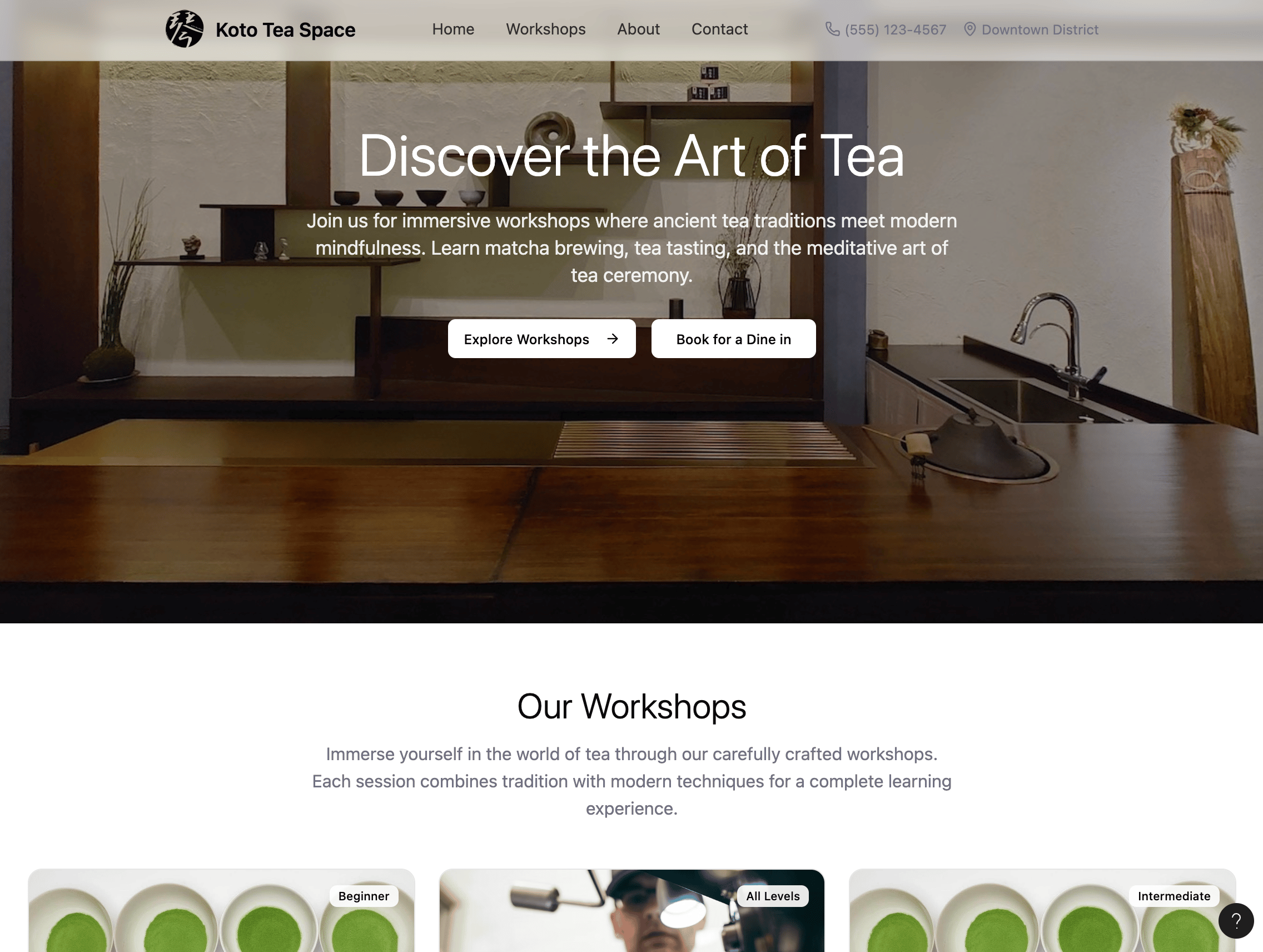
Workshop booking website built in Figma, with Figma Make and GPT integration behind the booking flow and recommendations.
The system behind LedgerPilot, built with Claude Design: colour and type tokens, status components that never rely on colour alone, and light and dark modes.
No projects in this category.
02 / Capabilities
User-centered design that connects business needs to intuitive, accessible experiences for enterprise tools, internal platforms and data-driven products.
I start from real user needs, using research, user flows, and testing to turn complex problems into clear, intuitive interfaces that people actually understand.
With a background in business and analytics, I connect design decisions to business goals, so every interface serves both the user and measurable outcomes.
I design with AI as part of my workflow, using Figma AI, Claude and Cowork to work faster and to build the trust and control that AI products need.
03 / Stack
04 / About
I bridge the gap between user needs and business targets, turning complex workflows and data into clear interfaces.
I'm a UX/UI designer with a background in business and data analytics, and I've worked internationally. I design interfaces, internal tools and data-driven products that deliver clarity and measurable impact.
I combine a UX/UI foundation with a business-aware mindset. Connecting user needs to business goals is what turns complexity into interfaces people can act on.
Focus Human-centered design / Enterprise tools / AI prototyping / Data-driven design / Accessibility
05 / Contact
Open to new opportunities. Email me or connect on LinkedIn to start the conversation.
Designing an intuitive B2B platform to connect, monitor and manage Plato robots and their devices remotely
A guided monitoring experience that let non-technical managers run their own robots. Workflow efficiency rose and users were satisfied.
I led the UX/UI and design-system work across the platform — from secure login to the monitoring dashboard and device-management features. I gathered user needs with PMs and POs, mapped the user flows and information architecture, designed the responsive high-fidelity screens, integrated the design system, ran usability testing with 8 operators, and wrote the UX spec with acceptance criteria for handoff to developers via Jira.
CobiotX is a cloud platform for managing connected devices remotely: Plato serving robots, their routers and their tablets. Clients needed one place to connect and pair each device (robot ↔ router ↔ tablet), keep it running, and store or export its data (for example, for Customer Success Managers). The existing tools were fragmented and too technical, which made pairing, monitoring and data handling slow and error-prone.
Design new, easy-to-use functionality on top of the platform, starting with secure login and the monitoring dashboard, then features like device pairing. The right people also needed access to it: a restaurant manager should be able to monitor and manage their own devices without technical help, while device data stayed centralized and exportable.
Long-term B2B SaaS project for clients operating Plato service robots. Collaborated with on-site managers, staff and technical teams to understand real device-management workflows, connectivity needs and safety constraints.
How I worked through the B2B workflow problems, step by step
Gathered product requirements from the PM, analyzed user pain points, and reviewed existing features to frame the problem.
Translated requirements into user stories with acceptance criteria, defining the features needed to solve each user need.
Mapped user flows and structured KPI hierarchies for an optimal dashboard structure.
Designed high-fidelity, responsive mockups, integrating the design system into the wireframes before hand-off.
Ran usability testing with 8 operators and iterated based on the findings.
Wrote the UX spec with acceptance criteria in Figma, then handed it off to the dev team via Jira.
What I chose, and why
Who CobiotX was designed for
Runs a busy mid-size restaurant using Plato serving robots to support staff during peak service.
Manages multiple restaurant accounts and keeps their Plato robot fleets operational and clients satisfied.
Syncing a Plato robot with its router and tablet through CobiotX
Responsive design for industrial workflow management
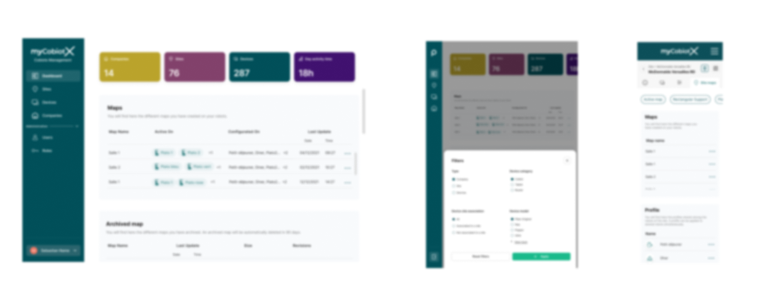
Working with on-site teams taught me to design for fast-paced, high-stakes environments where clarity and efficiency matter most.
Iterative testing showed that operators preferred a simple guided interface, a clear step-by-step flow for each task, over dense feature-heavy screens.
Email me and tell me what you're working on.
Building a scalable design system using Atomic Design, with design tokens and accessibility guidelines.
A 45+ component Atomic Design system with tokens and accessibility built in. Design-to-development handoff time dropped 65%, and the system was adopted company-wide.
As design system owner, I rebuilt the component library so each component was defined once and reused everywhere: variants, states, responsive versions, one documentation page each. I paired it with ergonomics rules covering usage, behaviour and limits, so design, dev and QA worked from the same spec and the products stayed consistent as they scaled. Handoff time dropped by roughly 65%.
Multiple product teams were building inconsistent UI components. That fragmented the user experience and slowed development. There was no centralized design system across platforms.
Create a scalable design system following Atomic Design principles, with documentation, accessibility guidelines and design tokens that reduce design-to-development handoff time by 65%.
Internal company initiative spanning multiple product teams. Collaborated with developers and product managers to establish design standards, applying accessibility best practices to build inclusive components from the start.
Building a system that scales across multiple product teams
Audited the UI across all products and ran workshops with cross-functional teams to understand each product's features and needs.
Established a design token hierarchy and semantic naming conventions as the foundation of the system.
Built 45+ components following Atomic Design with variants and states, designed around real product features and adapted for responsive layouts.
Ran accessibility testing and validated components with development teams, applying the system directly in wireframes to confirm it worked in real screens.
Wrote guidelines with usage examples and ergonomic rules so teams could apply the system consistently.
What I chose, and why
One source of truth for four teams
Quickly find the right component and stay consistent, so design work is faster and on-spec.
Reuse patterns, flows, and interaction rules to keep experiences coherent across products.
Integrate ready-made components directly instead of coding each UI element from scratch, so they build faster and with fewer mistakes.
Validate the final product against a single documented spec to catch inconsistencies early.
From design to shipped, validated against one spec
Atomic Design methodology in practice

The hardest part wasn't building the system, it was getting different teams to actually adopt it. Consistency only happens when people understand why the system helps them, rather than just knowing that it exists.
A design system isn't done when the components are built. It only works if it's documented and kept up to date, otherwise teams stop trusting it and go back to their own versions.
A design system is a long-term product, not a one-time deliverable. It needs constant iteration as products, teams and needs change.
Email me and tell me what you're working on.
Workshop booking website built in Figma, with an AI chatbot handling bookings and recommendations
A warm, self-serve booking experience for a tea-workshop space, with an AI assistant that answers questions, recommends the right session and takes bookings, so the owner spends less time on admin and more on hosting. In design and prototyping now.
As the sole designer and no-code builder, I’m shaping the whole thing end to end: the user journey, the visual design, the booking flow and the AI assistant. I prototype in Figma and wire the automation and GPT integration with no-code tools, testing ideas as I go.
A local tea-workshop space wants an online presence to take bookings, showcase its workshops and give people personalized recommendations. Manual booking is capping how much it can grow.
Design a self-serve booking website with an AI assistant that cuts the owner’s manual admin, while keeping the experience warm and personal rather than transactional.
A personal, in-progress project that pairs UX design with no-code automation, built in Figma with AI integration. About six weeks in.
Combining UX design with automation technology
Mapping customer touchpoints, from discovering the space to post-workshop follow-up.
Designing the booking and AI-assistant flows with no-code automation (Figma Make and GPT).
Building a warm interface around a tea-inspired palette and photography.
Next: test the booking flow and AI recommendations with a handful of early users.
Planned: a soft launch with light analytics to see what to refine.
What I chose, and why
A warm interface with automated booking
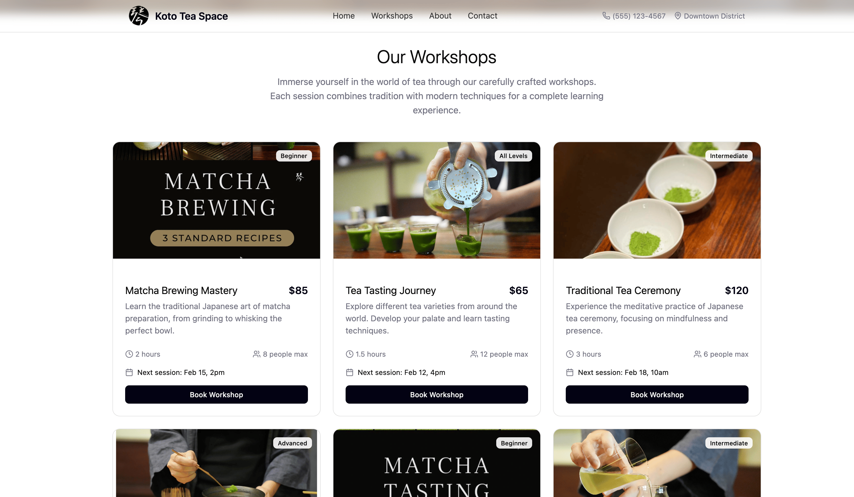
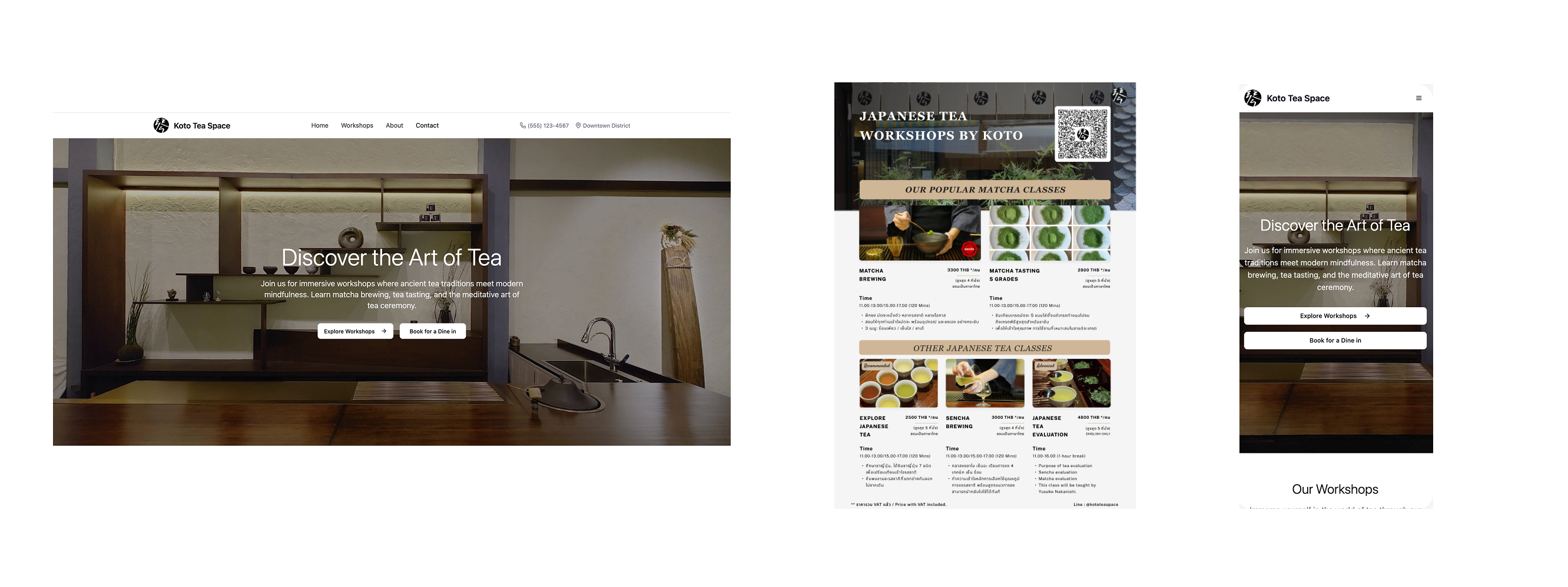
An honest snapshot of a project still in motion
Design and interface: in progress. I’m prototyping the site, the workshop showcase and the booking flow in Figma.
AI assistant and automation: in progress. I’m wiring bookings and recommendations with no-code tools (Figma Make and GPT), keeping a human, welcoming tone.
Next up: test the flow with a handful of early users, then a soft launch with light analytics to see what to refine.
Designing AI into the experience is mostly a balancing act: automation should save time without losing the human, welcoming feel, which matters even more in hospitality.
No-code tools like Figma Make and Lovable are letting me prototype and test complex automated flows on my own, without traditional development overhead.
Email me and tell me what you're working on.
An AI agent that automates expense and finance workflows. It categorizes spend, flags policy issues, drafts approvals and surfaces anomalies, with a human always in control.
A finance-review tool where the AI does the repetitive checking: categorizing spend, applying policy, flagging anomalies, but shows its work, so the accountable manager can verify each decision in seconds and stand behind it. The team keeps control of every consequential action.
Sole designer on this concept: defined the problem, ran secondary research (competitor-review analysis) and an expert interview, shaped the trust-and-control UX principle, and designed the review-and-approval flow end to end.
Finance teams spend hours checking expense claims by hand: against policy, for errors, in batches. AI can do that checking, but no one will let software approve spending they can't see into. The challenge: show the AI's work clearly enough that a manager can trust it, verify fast, and defend every decision.
Design a review-and-approval flow where the AI does the checking but the manager makes every decision. One rule throughout: the agent proposes, the human decides. The goal is faster review that preserves oversight and leaves an auditable record of who decided what, and why.
A concept project exploring how to design AI agents for high-stakes work where a person stays accountable for the outcome. The primary user is the finance reviewer. With limited direct access to finance professionals, the work draws on secondary research: real competitor-app reviews, with a planned expert interview to validate it. Personas remain hypotheses until tested against that input.
Designing an AI agent people can actually trust
Used AI to analyze real competitor-app reviews and map the expense-review workflow: where an agent adds value, and where a human has to stay in control.
Defined what the agent does (categorize, flag, detect) and what it never does alone (approve, pay), before designing any screens.
Sketched the core screens as low-fidelity wireframes in Claude Design to test the layout and the review-and-approve flow.
Built a design system in Claude Design and applied it across the screens to bring them to high fidelity, keeping styling consistent.
Once the flow is built in Lovable or Claude Code, test with users how much agent autonomy feels helpful vs. intrusive, and how errors and edge cases are surfaced.
Where four spend platforms stand on AI, control and auditability, and the gap this design targets
Each cell is rated Strong / Moderate / Basic, scored from aggregated G2, Capterra and TrustRadius reviews plus each vendor's current product docs.
| Platformavg strength | AI AgentAutomation and autonomy | UsabilityReview experience | ExplainabilityReasoning and control | AuditabilityAnomaly handling |
|---|---|---|---|---|
| Expensify1.6 / 3.0 | Basic OCR extraction plus policy-violation flags, not an autonomous agent. | Moderate Fast receipt capture, but tools feel buried; expenses ⇄ reports confusing. | Basic Shows extracted data and flags, but no reasoning or confidence: a "check each one" model. | Moderate Visible approval chains, but weak anomaly intelligence. |
| Ramp2.8 / 3.0 | Strong Four autonomous agents (coding, fraud, routing, payment); reviews 100%, escalates ~10-15%. | Strong Consistently praised as clean and intuitive. | Moderate Flags come with context, but heavy auto-approve hides the work from the reviewer. | Strong Real-time anomaly and fraud detection plus 3-way match; US / card-locked. |
| Pleo2.0 / 3.0 | Moderate Auto-extract and receipt-to-transaction matching, custom flows (European focus). | Strong Clean, low training time, a top-cited strength. | Basic Automates approvals, little reasoning surfaced; config struggles on complex flows. | Moderate Approval flows and limits, but anomaly detection is not a focus. |
| Spendesk2.1 / 3.0 | Moderate Automated workflows and spend controls, less agent-heavy. | Strong Guided, step-by-step; thin on analytics and customization. | Moderate Strong on control (per-user rules, 100% visibility), light on the "why". | Moderate Real-time feeds and card limits; modest anomaly logic. |
Meters and ratings at a glance. Enlarge for each vendor's notes.
What I chose, and why
A hypothesis to validate, not a researched persona
Reviews and approves employee expense claims.
7 screens, low fidelity, before the Design system's elements are applied


High-fidelity screens in the LedgerPilot design system


Built with Claude Design. 4 foundations shown here: explore the full design system below.
--brand-primary#1055C9Primary actions, links, active states--brand-primary-hover#0D47A8Hover--brand-primary-active#0A3B8CPressed--brand-primary-weak#E7F0FFTint / secondary hover--ai-bg#E7F0FFAI proposal background--ai-text#1055C9AI proposal text--ai-border#BAD3FBAI proposal borderEvery status pairs a colour with an icon and a written label, so the meaning survives colour blindness and greyscale printing.
Primary is filled, secondary is outlined, tertiary is quiet. Consequential actions stay disabled until their precondition is met.
The hardest part was trust. People will accept an agent's help once they can see how it reached a suggestion and override it, as long as the decisions that carry weight stay with them.
Being able to explain a decision, and leaving a clear audit trail, mattered more than how much the agent could do on its own. It proposes; the person decides.
In finance, replacing the person was never the point. The agent takes the tedious work off their plate, and the judgment stays with them.
Email me and tell me what you're working on.
A calm blue-on-neutral system, built for clarity under dense financial data. Consistent tokens, type, and components across every screen.
One system, built once, reused everywhere: for consistency across screens and faster development.
Brand, AI proposal, status and neutrals
--brand-primary#1055C9Primary actions, links, active states--brand-primary-hover#0D47A8Hover--brand-primary-active#0A3B8CPressed--brand-primary-weak#E7F0FFTint / secondary hover--ai-bg#E7F0FFAI proposal background--ai-text#1055C9AI proposal text--ai-border#BAD3FBAI proposal border| Badge | Token | Base | Background | Text |
|---|---|---|---|---|
| Approved | --status-approved | #91D06C | #EEF8E6 | #3F7A1E |
| Needs review | --status-review | #F5B21A | #FEF4DC | #8A5D00 |
| Policy error | --status-error | #E5484D | #FDECEC | #B42227 |
| Anomaly | --status-anomaly | #F76B15 | #FDEEE1 | #B24704 |
0#FFFFFF50#F8FAFC100#F1F4F8200#E4E7EC300#D3D8E0400#9AA3B2500#6B7280600#4B5563700#374151800#232830900#1A1D21Inter, body minimum 15px, tabular figures for money
Regular400Medium500Semibold600Bold700tnum€1.240,00Money columns align on the decimal because every digit occupies the same width.
A five-step scale; flat by default with lift reserved for panels and modals
--space-14px--space-28px--space-316px--space-424px--space-532px--radius8pxAll corners--radius-sm6pxInner elements--radius-pill999pxBadges and pills--shadow-noneDefault--shadow-cardCards--shadow-raisedPanels--shadow-overlayModalsButton and status badge rebuilt here; the rest are specified in the system
Sizes 32 / 40 / 44px. The 44px size meets the mobile tap-target minimum.
Colour, icon and label always travel together.
The constraints that make the principle enforceable
See how these foundations are applied across the review flow.
Koena Connect: the platform where users report accessibility and usability issues on a partner's website, and Koena's team mediates them
People with disabilities regularly hit accessibility and usability barriers on public-service websites, with no simple way to report them or get help. Partner organisations needed a channel to receive, sort and resolve those problems.
As the sole UX designer at Koena, I designed Koena Connect end to end: the user request flow, the admin management interface, and a client onboarding page, aligned with usability criteria and WCAG, with concrete interface proposals for users and clients.
Built and run during an experimentation phase with real partners: STIVO with Île-de-France Mobilités. The partnership with STIVO continues in production.
Designing, testing and iterating an accessible mediation platform
Designed the platform against usability criteria, covering the user request flow and the admin management interface, for an intuitive and accessible experience.
Analysed usability issues and applied WCAG to identify what to improve, then proposed concrete interface solutions for users and clients.
Designed an onboarding page for our client STIVO to filter out irrelevant requests before they reach mediation.
Ran usability tests with users who have disabilities, on both the platform and the onboarding page.
Where we hit difficulties, I proposed changes and refined the design iteratively, round by round.
From a barrier on the partner's site to a request that gets resolved or routed
The platform, its onboarding, and the request flow as shipped with STIVO


Testing directly with users who have disabilities surfaced problems no guideline check alone would catch, and it made every iteration sharper.
Clearly separating accessibility, usability and out-of-scope requests kept mediation fast and made the platform's value obvious to clients.
Email me and tell me what you're working on.
UI/UX design for the Plato serving-robot app at Aldebaran, taken from Android to a web application on a shared design system and Material Design 3.
A consistent, accessible Plato experience, taken from Android to web on a shared design system, with UX modes designed for the realities of live service, deployed on robots and used in the field.
As the UI/UX designer, I led the creation and enhancement of every interface and function of the Plato app, first on Android and then extended to a web application. I brought the design system and Material Design 3 into each screen for consistency, accessibility and an intuitive experience. On the UX side, I designed modes such as Birthday Mode, Follow-me mode and Slow Mode, crafted for scenarios with delicate and fragile items. I also worked closely with developers to resolve UX challenges and technical bugs and to keep the interface performing smoothly.
Service staff relied on PLATO to handle multiple delivery tasks, but the existing interface made it difficult to configure routes, monitor robot status, and manage tasks efficiently. Unclear workflows and scattered controls created delays and confusion during busy service hours.
Redesign PLATO's interface to speed up task assignment, improve status visibility and simplify robot configuration. The goal was faster, more intuitive day-to-day operations for restaurant and hotel staff, with consistent workflows across every robot task.
Plato is a serving robot used across restaurants, hotels, healthcare, and events. I worked closely with the product manager and developers to analyze workflows, identify usability issues, and propose scalable UI and interaction improvements aligned with technical constraints.
A serving robot for people, built by Aldebaran (United Robotics Group)


Building safety and efficiency into every interaction
Gathered user needs and business goals with the Product Manager, then mapped workflows, technical constraints, and ergonomics to understand operational pain points.
Defined core tasks, restructured navigation and hierarchy, and mapped robot configuration and delivery flows.
Designed main screens, robot status views and configuration interfaces on a scalable design system and Material Design 3, aligned with development constraints.
Conducted usability tests with internal users and iterated on hierarchy, task clarity, and interaction patterns to reduce friction.
Delivered user flows, detailed specifications, a component library and a global design system for both the design and development teams.
Interaction modes for real-world, delicate service
Turns a simple drop-off into a small celebration, so staff can make a guest’s moment feel special.
Plato follows a staff member through the space for guided, hands-free transport between points.
A gentler pace for delicate and fragile items, reducing the risk of spills or damage in transit.
Who the PLATO redesign was designed for
Uses PLATO during busy service to run food and drinks to tables while juggling many other tasks.
Sets up PLATO for the venue and oversees smooth service across the floor during peak hours.
Assigning and sending a delivery task to PLATO
The Plato mission interface, setting up and running a delivery

Service-robot interfaces must reduce cognitive load for restaurant and hotel staff. Controls need to be simple, predictable, and easy to learn so teams can act quickly during busy hours.
Clear task visibility and real-time robot status help staff make faster decisions, coordinate service flow, and avoid interruptions during customer service.
Email me and tell me what you're working on.